
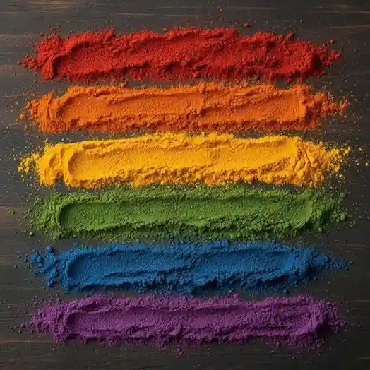
A clearer way to present colours as a dedicated product family.
This page positions colours as a focused commercial category instead of a generic side listing, helping buyers understand where the application value sits.
Explore colour application directions
These spotlight sections help explain where colour systems fit across your commercial product range.


Sunset Yellow Colour
Suitable for confectionery, beverages and bakery applications requiring a bright yellow appearance.


Orange Colour
Useful for products requiring warm orange-yellow tone and stronger visual impact.


Carmoisine Colour
Built for applications requiring a deeper red-pink tone and broad industry familiarity.

Chocolate Brown Colour
Suitable for bakery, confectionery and dessert applications requiring richer brown tone.


Brilliant Blue Colour
Designed for beverages and confectionery requiring a cleaner blue visual identity.


Green Colour
Useful for applications requiring a more natural greeny direction and cleaner label positioning.
Why businesses use Blossom Flavours for colours
Colour presentation needs clearer category framing, practical application fit and better commercial explanation.
Category Clarity
Built to help buyers understand where colour systems fit in the overall product family.
Application Fit
Supports discussion around real food and beverage use cases.
Commercial Presentation
Suitable for industrial and B2B product conversations.
Food Colours FAQs
For Food Colours And Its Types
Do you support pharma and nutraceutical flavour applications?
Can you support difficult taste formats?
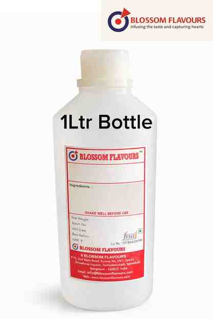
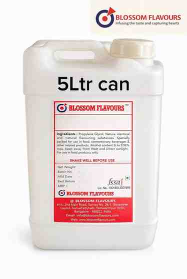
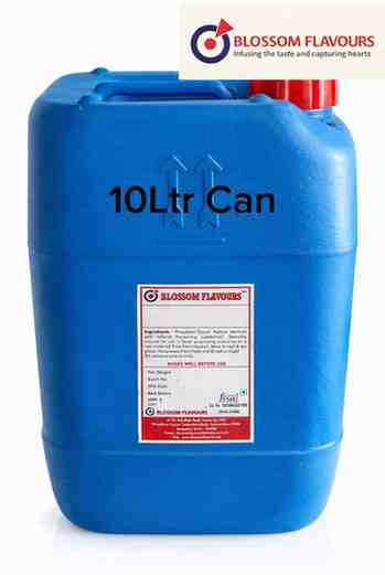
Do you supply in bulk for commercial use?
Can you develop custom systems for specific dosage formats?
Need to discuss your colour requirement?
Use this page as the starting point for category and application discussion around colour systems.

